
Overview
We will cover the basics of using the Matplotlib library to create plots in Python, including a few different plots available within the library. This page is laid out as follows:
- Why Matplotlib?
- Figure and axes
- Basic line plots
- Labels and grid lines
- Customizing colors
- Subplots
- Scatterplots
- Displaying Images
- Contour and filled contour plots.
Prerequisites
| Concepts | Importance | Notes |
|---|---|---|
| NumPy Basics | Necessary | |
| MATLAB plotting experience | Helpful |
- Time to Learn: 30 minutes
Imports
Let’s import the Matplotlib library’s pyplot interface; this interface is the simplest way to create new Matplotlib figures. To shorten this long name, we import it as plt; this helps keep things short, but clear.
import matplotlib.pyplot as plt
import numpy as np
Info
Matplotlib is a Python 2-D plotting library. It is used to produce publication quality figures in a variety of hard-copy formats and interactive environments across platforms.Generate test data using NumPy
Here, we generate some test data to use for experimenting with plotting:
times = np.array(
    [
        93.0,
        96.0,
        99.0,
        102.0,
        105.0,
        108.0,
        111.0,
        114.0,
        117.0,
        120.0,
        123.0,
        126.0,
        129.0,
        132.0,
        135.0,
        138.0,
        141.0,
        144.0,
        147.0,
        150.0,
        153.0,
        156.0,
        159.0,
        162.0,
    ]
)
temps = np.array(
    [
        310.7,
        308.0,
        296.4,
        289.5,
        288.5,
        287.1,
        301.1,
        308.3,
        311.5,
        305.1,
        295.6,
        292.4,
        290.4,
        289.1,
        299.4,
        307.9,
        316.6,
        293.9,
        291.2,
        289.8,
        287.1,
        285.8,
        303.3,
        310.0,
    ]
)
Figure and Axes
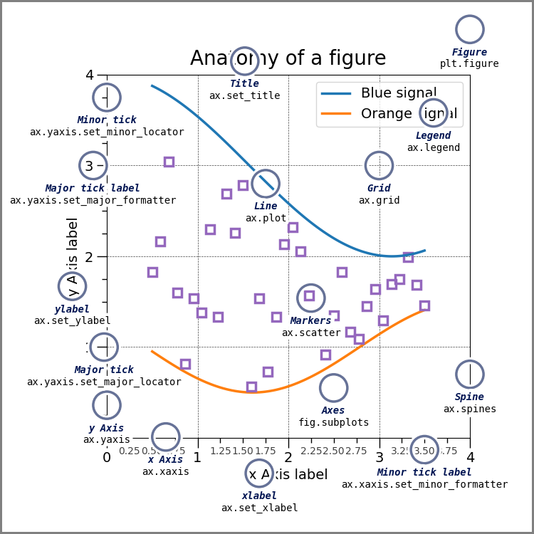
Now, let’s make our first plot with Matplotlib. Matplotlib has two core objects: the Figure and the Axes. The Axes object is an individual plot, containing an x-axis, a y-axis, labels, etc.; it also contains all of the various methods we might use for plotting. A Figure contains one or more Axes objects; it also contains methods for saving plots to files (e.g., PNG, SVG), among other similar high-level functionality. You may find the following diagram helpful:
Basic Line Plots
Let’s create a Figure whose dimensions, if printed out on hardcopy, would be 10 inches wide and 6 inches long (assuming a landscape orientation). We then create an Axes object, consisting of a single subplot, on the Figure. After that, we call the Axes object’s plot method, using the times array for the data along the x-axis (i.e., the independent values), and the temps array for the data along the y-axis (i.e., the dependent values).
Info
By default,ax.plot will create a line plot, as seen in the following example:# Create a figure
fig = plt.figure(figsize=(10, 6))
# Ask, out of a 1x1 grid of plots, the first axes.
ax = fig.add_subplot(1, 1, 1)
# Plot times as x-variable and temperatures as y-variable
ax.plot(times, temps);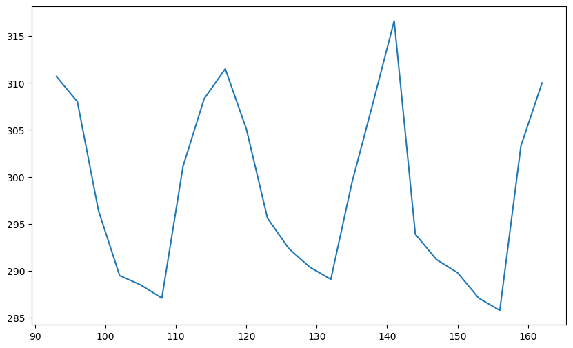
Labels and Grid Lines
Adding labels to an Axes object
Next, we add x-axis and y-axis labels to our Axes object, like this:
# Add some labels to the plot
ax.set_xlabel('Time')
ax.set_ylabel('Temperature')

# Prompt the notebook to re-display the figure after we modify it
fig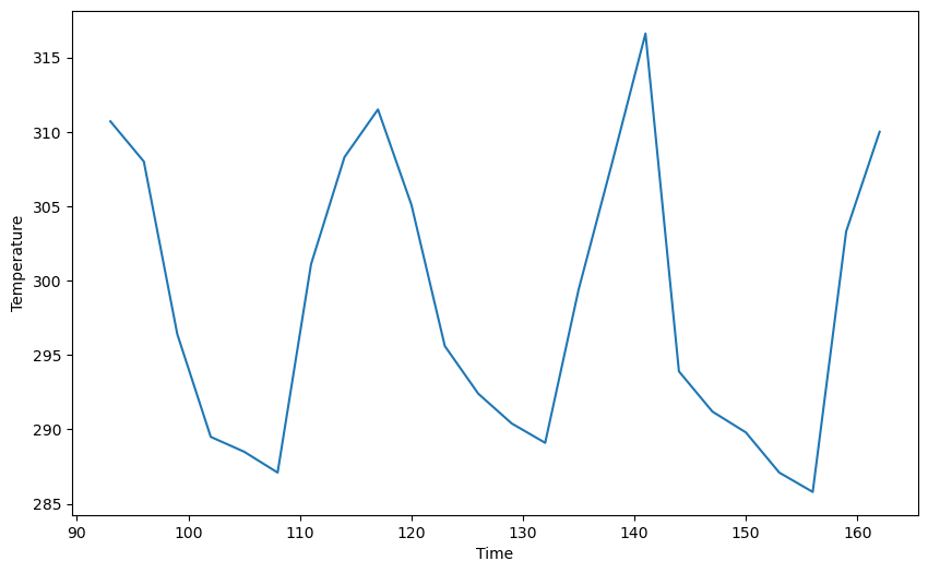
We can also add a title to the plot and increase the font size:
ax.set_title('GFS Temperature Forecast', size=16)

fig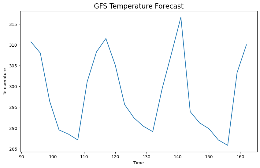
There are many other functions and methods associated with Axes objects and labels, but they are too numerous to list here.
Here, we set up another test array of temperature data, to be used later:
temps_1000 = np.array(
    [
        316.0,
        316.3,
        308.9,
        304.0,
        302.0,
        300.8,
        306.2,
        309.8,
        313.5,
        313.3,
        308.3,
        304.9,
        301.0,
        299.2,
        302.6,
        309.0,
        311.8,
        304.7,
        304.6,
        301.8,
        300.6,
        299.9,
        306.3,
        311.3,
    ]
)
Adding labels and a grid
Here, we call plot more than once, in order to plot multiple series of temperature data on the same plot. We also specify the label keyword argument to the plot method to allow Matplotlib to automatically create legend labels. These legend labels are added via a call to the legend method. By utilizing the grid() method, we can also add gridlines to our plot.
fig = plt.figure(figsize=(10, 6))
ax = fig.add_subplot(1, 1, 1)

# Plot two series of data
# The label argument is used when generating a legend.
ax.plot(times, temps, label='Temperature (surface)')
ax.plot(times, temps_1000, label='Temperature (1000 mb)')

# Add labels and title
ax.set_xlabel('Time')
ax.set_ylabel('Temperature')
ax.set_title('Temperature Forecast')

# Add gridlines
ax.grid(True)

# Add a legend to the upper left corner of the plot
ax.legend(loc='upper left');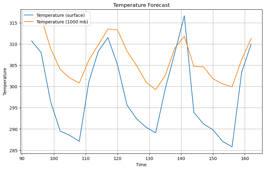
Customizing colors
We’re not restricted to the default look for plot elements. Most plot elements have style attributes, such as linestyle and color, that can be modified to customize the look of a plot. For example, the color attribute can accept a wide array of color options, including keywords (named colors) like red or blue, or HTML color codes. Here, we use some different shades of red taken from the Tableau colorset in Matplotlib, by using the tab:red option for the color attribute.
fig = plt.figure(figsize=(10, 6))
ax = fig.add_subplot(1, 1, 1)

# Specify how our lines should look
ax.plot(times, temps, color='tab:red', label='Temperature (surface)')
ax.plot(
    times,
    temps_1000,
    color='tab:red',
    linestyle='--',
    label='Temperature (isobaric level)',
)

# Set the labels and title
ax.set_xlabel('Time')
ax.set_ylabel('Temperature')
ax.set_title('Temperature Forecast')

# Add the grid
ax.grid(True)

# Add a legend to the upper left corner of the plot
ax.legend(loc='upper left');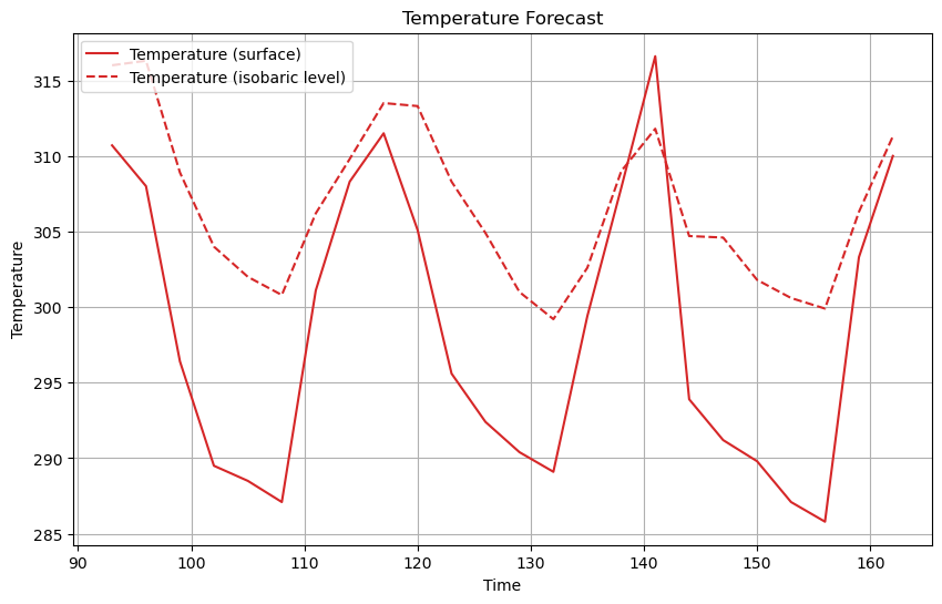
Subplots
The term “subplots” refers to working with multiple plots, or panels, in a figure.
Here, we create yet another set of test data, in this case dew-point data, to be used in later examples:
dewpoint = 0.9 * temps
dewpoint_1000 = 0.9 * temps_1000
Now, we can use subplots to plot this new data alongside the temperature data.
Using add_subplot to create two different subplots within the figure
We can use the .add_subplot() method to add subplots to our figure! This method takes the arguments (rows, columns, subplot_number).
For example, if we want a single row and two columns, we can use the following code block:
fig = plt.figure(figsize=(10, 6))

# Create a plot for temperature
ax = fig.add_subplot(1, 2, 1)
ax.plot(times, temps, color='tab:red')

# Create a plot for dewpoint
ax2 = fig.add_subplot(1, 2, 2)
ax2.plot(times, dewpoint, color='tab:green');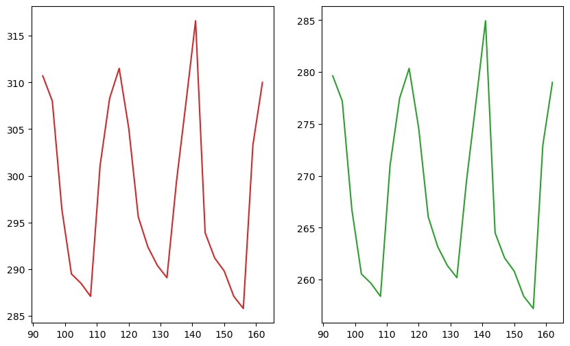
You can also call plot.subplots() with the keyword arguments nrows (number of rows) and ncols (number of columns). This initializes a new Axes object, called ax, with the specified number of rows and columns. This object also contains a 1-D list of subplots, with a size equal to nrows x ncols.
You can index this list, using ax[0].plot(), for example, to decide which subplot you’re plotting to. Here is some example code for this technique:
fig, ax = plt.subplots(nrows=1, ncols=2, figsize=(10, 6))

ax[0].plot(times, temps, color='tab:red')
ax[1].plot(times, dewpoint, color='tab:green');
Adding titles to each subplot
We can add titles to these plots too; notice that these subplots are titled separately, by calling ax.set_title after plotting each subplot:
fig = plt.figure(figsize=(10, 6))

# Create a plot for temperature
ax = fig.add_subplot(1, 2, 1)
ax.plot(times, temps, color='tab:red')
ax.set_title('Temperature')

# Create a plot for dewpoint
ax2 = fig.add_subplot(1, 2, 2)
ax2.plot(times, dewpoint, color='tab:green')
ax2.set_title('Dewpoint');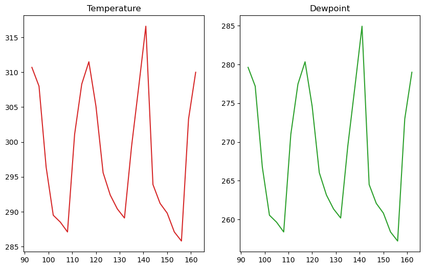
Using ax.set_xlim and ax.set_ylim to control the plot boundaries
It is common when plotting data to set the extent (boundaries) of plots, which can be performed by calling .set_xlim and .set_ylim on the Axes object containing the plot or subplot(s):
fig = plt.figure(figsize=(10, 6))

# Create a plot for temperature
ax = fig.add_subplot(1, 2, 1)
ax.plot(times, temps, color='tab:red')
ax.set_title('Temperature')
ax.set_xlim(110, 130)
ax.set_ylim(290, 315)

# Create a plot for dewpoint
ax2 = fig.add_subplot(1, 2, 2)
ax2.plot(times, dewpoint, color='tab:green')
ax2.set_title('Dewpoint')
ax2.set_xlim(110, 130);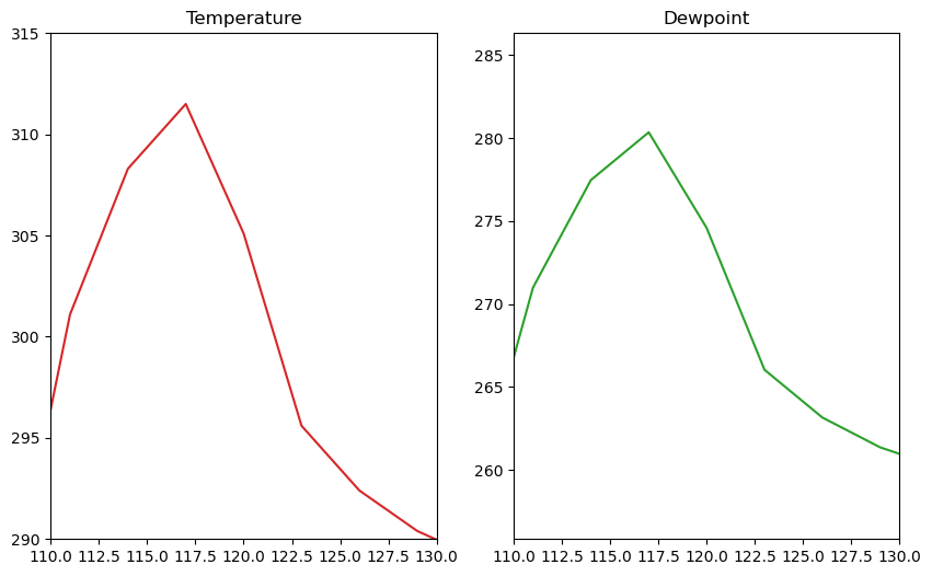
Using sharex and sharey to share plot limits
You may want to have both subplots share the same x/y axis limits. When setting up a new Axes object through a method like add_subplot, specify the keyword arguments sharex=ax and sharey=ax, where ax is the Axes object with which to share axis limits.
Let’s take a look at an example:
fig = plt.figure(figsize=(10, 6))

# Create a plot for temperature
ax = fig.add_subplot(1, 2, 1)
ax.plot(times, temps, color='tab:red')
ax.set_title('Temperature')
ax.set_ylim(260, 320)

# Create a plot for dewpoint
ax2 = fig.add_subplot(1, 2, 2, sharex=ax, sharey=ax)
ax2.plot(times, dewpoint, color='tab:green')
ax2.set_title('Dewpoint');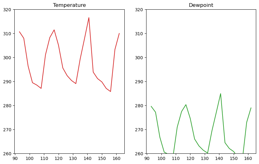
Putting this all together
Info
If desired, you can move the location of your legend; to do this, specify theloc keyword argument when calling ax.legend().fig = plt.figure(figsize=(10, 6))
ax = fig.add_subplot(1, 2, 1)
# Specify how our lines should look
ax.plot(times, temps, color='tab:red', label='Temperature (surface)')
ax.plot(
times,
temps_1000,
color='tab:red',
linestyle=':',
label='Temperature (isobaric level)',
)
# Add labels, grid, and legend
ax.set_xlabel('Time')
ax.set_ylabel('Temperature')
ax.set_title('Temperature Forecast')
ax.grid(True)
ax.legend(loc='upper left')
ax.set_ylim(257, 312)
ax.set_xlim(95, 162)
# Add our second plot - for dewpoint, changing the colors and labels
ax2 = fig.add_subplot(1, 2, 2, sharex=ax, sharey=ax)
ax2.plot(times, dewpoint, color='tab:green', label='Dewpoint (surface)')
ax2.plot(
times,
dewpoint_1000,
color='tab:green',
linestyle=':',
marker='o',
label='Dewpoint (isobaric level)',
)
ax2.set_xlabel('Time')
ax2.set_ylabel('Dewpoint')
ax2.set_title('Dewpoint Forecast')
ax2.grid(True)
ax2.legend(loc='upper left');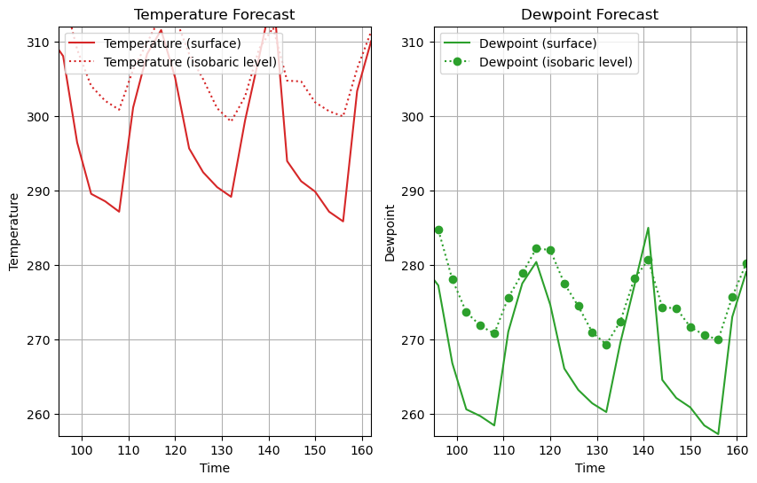
Scatterplot
Some data cannot be plotted accurately as a line plot. Another type of plot that is popular in science is the marker plot, more commonly known as a scatter plot. A simple scatter plot can be created by setting the linestyle to None, and specifying a marker type, size, color, etc., like this:
fig = plt.figure(figsize=(10, 6))
ax = fig.add_subplot(1, 1, 1)

# Specify no line with circle markers
ax.plot(temps, temps_1000, linestyle='None', marker='o', markersize=5)

ax.set_xlabel('Temperature (surface)')
ax.set_ylabel('Temperature (1000 hPa)')
ax.set_title('Temperature Cross Plot')
ax.grid(True);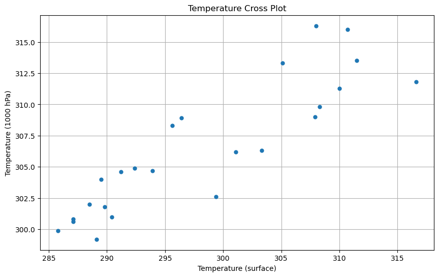
Info
You can also use thescatter method, which is slower, but will give you more control, such as being able to color the points individually based upon a third variable.fig = plt.figure(figsize=(10, 6))
ax = fig.add_subplot(1, 1, 1)
# Specify no line with circle markers
ax.scatter(temps, temps_1000)
ax.set_xlabel('Temperature (surface)')
ax.set_ylabel('Temperature (1000 hPa)')
ax.set_title('Temperature Cross Plot')
ax.grid(True);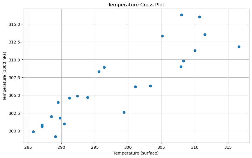
Let’s put together the following:
- Beginning with our code above, add the
ckeyword argument to thescattercall; in this case, to color the points by the difference between the temperature at the surface and the temperature at 1000 hPa. - Add a 1:1 line to the plot (slope of 1, intercept of zero). Use a black dashed line.
- Change the colormap to one more suited for a temperature-difference plot.
- Add a colorbar to the plot (have a look at the Matplotlib documentation for help).
fig = plt.figure(figsize=(10, 6))
ax = fig.add_subplot(1, 1, 1)

ax.plot([285, 320], [285, 320], color='black', linestyle='--')
s = ax.scatter(temps, temps_1000, c=(temps - temps_1000), cmap='bwr', vmin=-5, vmax=5)
fig.colorbar(s)

ax.set_xlabel('Temperature (surface)')
ax.set_ylabel('Temperature (1000 hPa)')
ax.set_title('Temperature Cross Plot')
ax.grid(True);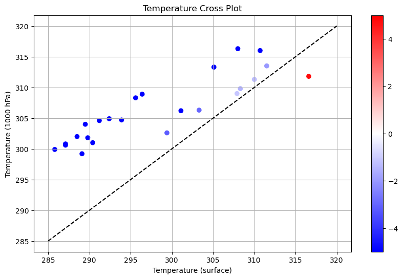
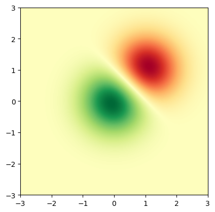
Displaying Images
imshow displays the values in an array as colored pixels, similar to a heat map.
Here, we declare some fake data in a bivariate normal distribution, to illustrate the imshow method:
x = y = np.arange(-3.0, 3.0, 0.025)
X, Y = np.meshgrid(x, y)
Z1 = np.exp(-(X**2) - Y**2)
Z2 = np.exp(-((X - 1) ** 2) - (Y - 1) ** 2)
Z = (Z1 - Z2) * 2
We can now pass this fake data to imshow to create a heat map of the distribution:
fig, ax = plt.subplots()
im = ax.imshow(
    Z, interpolation='bilinear', cmap='RdYlGn', origin='lower', extent=[-3, 3, -3, 3]
)
Contour and Filled Contour Plots
contourcreates contours around data.contourfcreates filled contours around data.
Let’s start with the contour method, which, as just mentioned, creates contours around data:
fig, ax = plt.subplots()
ax.contour(X, Y, Z);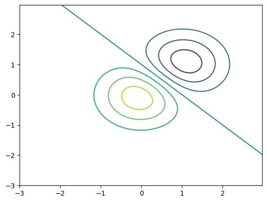
After creating contours, we can label the lines using the clabel method, like this:
fig, ax = plt.subplots()
c = ax.contour(X, Y, Z, levels=np.arange(-2, 2, 0.25))
ax.clabel(c);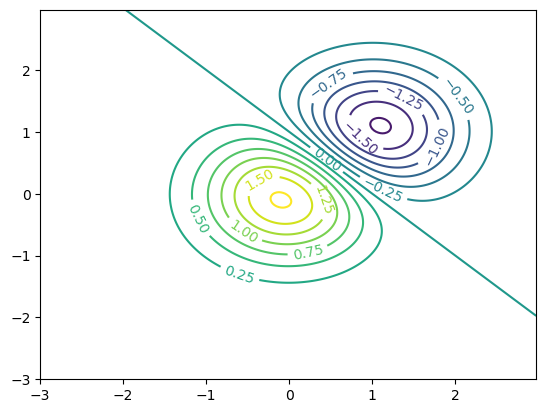
As described above, the contourf (contour fill) method creates filled contours around data, like this:
fig, ax = plt.subplots()
c = ax.contourf(X, Y, Z);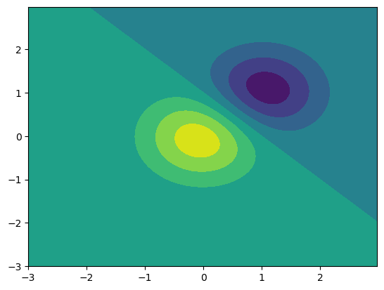
As a final example, let’s create a heatmap figure with contours using the contour and imshow methods. First, we use imshow to create the heatmap, specifying a colormap using the cmap keyword argument. We then call contour, specifying black contours and an interval of 0.5. Here is the example code, and resulting figure:
fig, ax = plt.subplots()
im = ax.imshow(
    Z, interpolation='bilinear', cmap='PiYG', origin='lower', extent=[-3, 3, -3, 3]
)
c = ax.contour(X, Y, Z, levels=np.arange(-2, 2, 0.5), colors='black')
ax.clabel(c);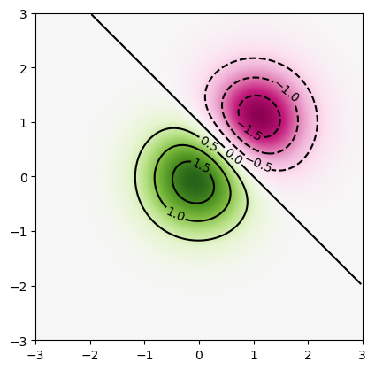
Summary
Matplotlibcan be used to visualize datasets you are working with.- You can customize various features such as labels and styles.
- There are a wide variety of plotting options available, including (but not limited to):
- Line plots (
plot) - Scatter plots (
scatter) - Heatmaps (
imshow) - Contour line and contour fill plots (
contour,contourf)
- Line plots (
What’s Next?
In the next section, more plotting functionality is covered, such as histograms, pie charts, and animation.
Resources and References
The goal of this tutorial is to provide an overview of the use of the Matplotlib library. It covers creating simple line plots, but it is by no means comprehensive. For more information, try looking at the following documentation: