Overview
In this tutorial, we perform and demonstrate the following tasks:
- Load SST data from the CESM2 model
- Mask data using
.where() - Compute climatologies and anomalies using
.groupby() - Use
.rolling()to compute moving average - Compute, normalize, and plot the Niño 3.4 Index
Prerequisites
| Concepts | Importance | Notes |
|---|---|---|
| Introduction to Xarray | Necessary | |
| Computation and Masking | Necessary |
- Time to learn: 20 minutes
Imports
For this tutorial, we import several Python packages. As plotting ENSO data requires a geographically accurate map, Cartopy is imported to handle geographic features and map projections. Xarray is used to manage raw data, and Matplotlib allows for feature-rich data plotting. Finally, a custom Pythia package is imported, in this case allowing access to the Pythia example data library.
import cartopy.crs as ccrs
import matplotlib.pyplot as plt
import xarray as xr
from pythia_datasets import DATASETS
/home/runner/micromamba/envs/pythia-book-dev/lib/python3.13/site-packages/pythia_datasets/__init__.py:4: UserWarning: pkg_resources is deprecated as an API. See https://setuptools.pypa.io/en/latest/pkg_resources.html. The pkg_resources package is slated for removal as early as 2025-11-30. Refrain from using this package or pin to Setuptools<81.
from pkg_resources import DistributionNotFound, get_distribution
The Niño 3.4 Index
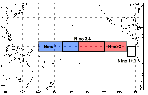
In this tutorial, we combine topics covered in previous Xarray tutorials to demonstrate a real-world example. The real-world scenario demonstrated in this tutorial is the computation of the Niño 3.4 Index, as shown in the CESM2 submission for the CMIP6 project. A rough definition of Niño 3.4, in addition to a definition of Niño data computation, is listed below:
Niño 3.4 (5N-5S, 170W-120W): The Niño 3.4 anomalies may be thought of as representing the average equatorial SSTs across the Pacific from about the dateline to the South American coast. The Niño 3.4 index typically uses a 5-month running mean, and El Niño or La Niña events are defined when the Niño 3.4 SSTs exceed +/- 0.4C for a period of six months or more.
Niño X Index computation: a) Compute area averaged total SST from Niño X region; b) Compute monthly climatology (e.g., 1950-1979) for area averaged total SST from Niño X region, and subtract climatology from area averaged total SST time series to obtain anomalies; c) Smooth the anomalies with a 5-month running mean; d) Normalize the smoothed values by its standard deviation over the climatological period.
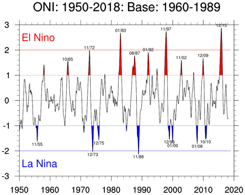
The overall goal of this tutorial is to produce a plot of ENSO data using Xarray; this plot will resemble the Oceanic Niño Index plot shown below.
In this first example, we begin by opening datasets containing the sea-surface temperature (SST) and grid-cell size data. (These datasets are taken from the Pythia example data library, using the Pythia package imported above.) The two datasets are then combined into a single dataset using Xarray’s merge method.
filepath = DATASETS.fetch('CESM2_sst_data.nc')
data = xr.open_dataset(filepath)
filepath2 = DATASETS.fetch('CESM2_grid_variables.nc')
areacello = xr.open_dataset(filepath2).areacello

ds = xr.merge([data, areacello])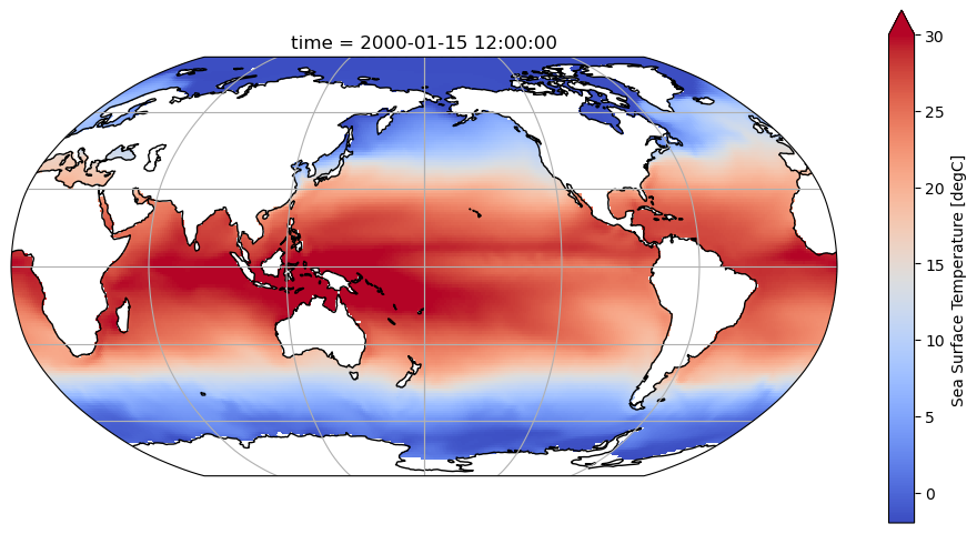
dsThis example uses Matplotlib and Cartopy to plot the first time slice of the dataset on an actual geographic map. By doing so, we verify that the data values fit the pattern of SST data:
fig = plt.figure(figsize=(12, 6))
ax = plt.axes(projection=ccrs.Robinson(central_longitude=180))
ax.coastlines()
ax.gridlines()
ds.tos.isel(time=0).plot(
    ax=ax, transform=ccrs.PlateCarree(), vmin=-2, vmax=30, cmap='coolwarm'
);
Select the Niño 3.4 region
In this set of examples, we demonstrate the selection of data values from a dataset which are located in the Niño 3.4 geographic region. The following example illustrates a selection technique that uses the sel() or isel() method:
tos_nino34 = ds.sel(lat=slice(-5, 5), lon=slice(190, 240))
tos_nino34This example illustrates the alternate technique for selecting Niño 3.4 data, which makes use of the where() method:
tos_nino34 = ds.where(
    (ds.lat < 5) & (ds.lat > -5) & (ds.lon > 190) & (ds.lon < 240), drop=True
)
tos_nino34Finally, we plot the selected region to ensure it fits the definition of the Niño 3.4 region:
fig = plt.figure(figsize=(12, 6))
ax = plt.axes(projection=ccrs.Robinson(central_longitude=180))
ax.coastlines()
ax.gridlines()
tos_nino34.tos.isel(time=0).plot(
    ax=ax, transform=ccrs.PlateCarree(), vmin=-2, vmax=30, cmap='coolwarm'
)
ax.set_extent((120, 300, 10, -10))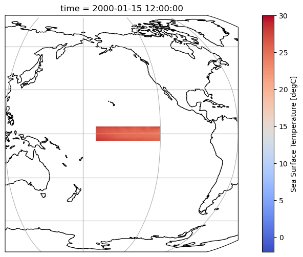
Compute the anomalies
There are three main steps to obtain the anomalies from the Niño 3.4 dataset created in the previous set of examples. First, we use the groupby() method to convert to monthly data. Second, we subtract the mean sea-surface temperature (SST) from the monthly data. Finally, we obtain the anomalies by computing a weighted average. These steps are illustrated in the next example:
gb = tos_nino34.tos.groupby('time.month')
tos_nino34_anom = gb - gb.mean(dim='time')
index_nino34 = tos_nino34_anom.weighted(tos_nino34.areacello).mean(dim=['lat', 'lon'])
In this example, we smooth the data curve by applying a mean function with a 5-month moving window to the anomaly dataset. We then plot the smoothed data against the original data to demonstrate:
index_nino34_rolling_mean = index_nino34.rolling(time=5, center=True).mean()index_nino34.plot(size=8)
index_nino34_rolling_mean.plot()
plt.legend(['anomaly', '5-month running mean anomaly'])
plt.title('SST anomaly over the Niño 3.4 region');
Since the ENSO index conveys deviations from a norm, the calculation of Niño data requires a standard deviation. In this example, we calculate the standard deviation of the SST in the Niño 3.4 region data, across the entire time period of the data array:
std_dev = tos_nino34.tos.std()
std_devThe final step of the Niño 3.4 index calculation involves normalizing the data. In this example, we perform this normalization by dividing the smoothed anomaly data by the standard deviation calculated above:
normalized_index_nino34_rolling_mean = index_nino34_rolling_mean / std_devVisualize the computed Niño 3.4 index
In this example, we use Matplotlib to generate a plot of our final Niño 3.4 data. This plot is set up to highlight values above 0.5, corresponding to El Niño (warm) events, and values below -0.5, corresponding to La Niña (cold) events.
fig = plt.figure(figsize=(12, 6))

plt.fill_between(
    normalized_index_nino34_rolling_mean.time.data,
    normalized_index_nino34_rolling_mean.where(
        normalized_index_nino34_rolling_mean >= 0.4
    ).data,
    0.4,
    color='red',
    alpha=0.9,
)
plt.fill_between(
    normalized_index_nino34_rolling_mean.time.data,
    normalized_index_nino34_rolling_mean.where(
        normalized_index_nino34_rolling_mean <= -0.4
    ).data,
    -0.4,
    color='blue',
    alpha=0.9,
)

normalized_index_nino34_rolling_mean.plot(color='black')
plt.axhline(0, color='black', lw=0.5)
plt.axhline(0.4, color='black', linewidth=0.5, linestyle='dotted')
plt.axhline(-0.4, color='black', linewidth=0.5, linestyle='dotted')
plt.title('Niño 3.4 Index');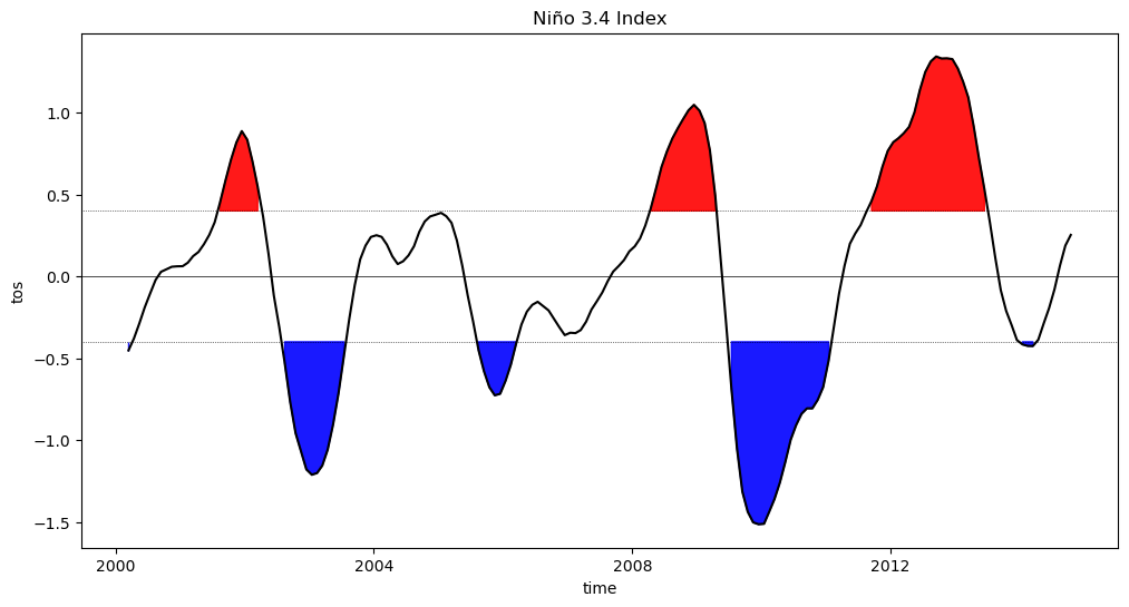
Summary
This tutorial covered the use of Xarray features, including selection, grouping, and statistical functions, to compute and visualize a data index important to climate science.
Resources and References
- Niño 3.4 index
- Matplotlib’s
fill_betweenmethod - Matplotlib’s
axhlinemethod (see also its analogousaxvlinemethod)