
Overview
In this section we’ll explore some more specialized plot types, including:
- Histograms
- Pie Charts
- Animations
Prerequisites
| Concepts | Importance | Notes |
|---|---|---|
| NumPy Basics | Necessary | |
| Matplotlib Basics | Necessary |
- Time to Learn: 30 minutes
Imports
Just like in the previous tutorial, we are going to import Matplotlib’s pyplot interface as plt. We must also import numpy for working with data arrays.
import matplotlib.pyplot as plt
import numpy as np
Histograms
We can plot a 1-D histogram using most 1-D data arrays.
To get the 1-D data array for this example, we generate example data using NumPy’s normal-distribution random-number generator. For demonstration purposes, we’ve specified the random seed for reproducibility. The code for this number generation is as follows:
npts = 2500
nbins = 15

np.random.seed(0)
x = np.random.normal(size=npts)
Now that we have our data array, we can make a histogram using plt.hist. In this case, we change the y-axis to represent probability, instead of count; this is performed by setting density=True.
plt.hist(x, bins=nbins, density=True)
plt.title('1D histogram')
plt.xlabel('Data')
plt.ylabel('Probability');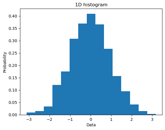
Similarly, we can make a 2-D histogram, by first generating a second 1-D array, and then calling plt.hist2d with both 1-D arrays as arguments:
y = np.random.normal(size=npts)

plt.hist2d(x, y, bins=nbins);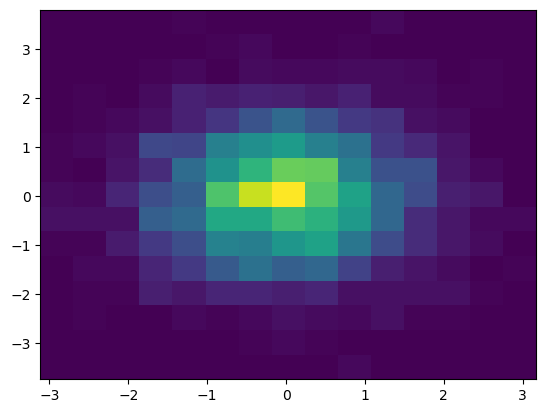
Pie Charts
Matplotlib also has the capability to plot pie charts, by way of plt.pie. The most basic implementation uses a 1-D array of wedge ‘sizes’ (i.e., percent values), as shown below:
x = np.array([25, 15, 20, 40])
plt.pie(x);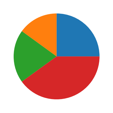
Typically, you’ll see examples where all of the values in the array x will sum to 100, but the data values provided to plt.pie do not necessarily have to add up to 100. The sum of the numbers provided will be normalized to 1, and the individual values will thereby be converted to percentages, regardless of the actual sum of the values. If this behavior is unwanted or unneeded, you can set normalize=False.
If you set normalize=False, and the sum of the values of x is less than 1, then a partial pie chart is plotted. If the values sum to larger than 1, a ValueError will be raised.
x = np.array([0.25, 0.20, 0.40])
plt.pie(x, normalize=False);
Let’s do a more complicated example.
Here we create a pie chart with various sizes associated with each color. Labels are derived by capitalizing each color in the array colors. Since colors can be specified by strings corresponding to named colors, this allows both the colors and the labels to be set from the same array, reducing code and effort.
If you want to offset one or more wedges for effect, you can use the explode keyword argument. The value for this argument must be a list of floating-point numbers with the same length as the number of wedges. The numbers indicate the percentage of offset for each wedge. In this example, each wedge is not offset except for the pink (3rd index).
colors = ['red', 'blue', 'yellow', 'pink', 'green']
labels = [c.capitalize() for c in colors]

sizes = [1, 3, 5, 7, 9]
explode = (0, 0, 0, 0.1, 0)


plt.pie(sizes, labels=labels, explode=explode, colors=colors, autopct='%1.1f%%');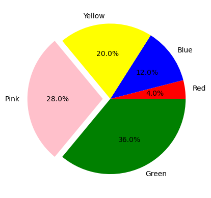
Animations
Matplotlib offers a single commonly-used animation tool, FuncAnimation. This tool must be imported separately through Matplotlib’s animation package, as shown below. You can find more information on animation with Matplotlib at the official documentation page.
from matplotlib.animation import FuncAnimationFuncAnimation creates animations by repeatedly calling a function. Using this method involves three main steps:
- Create an initial state of the plot
- Make a function that can “progress” the plot to the next frame of the animation
- Create the animation using FuncAnimation
For this example, let’s create an animated sine wave.
Step 1: Initial State
In the initial state step, we will define a function called init. This function will then create the animation plot in its initial state. However, please note that the successful use of FuncAnimation does not technically require such a function; in a later example, creating animations without an initial-state function is demonstrated.
First, we’ll define Figure and Axes objects. After that, we can create a line-plot object (referred to here as a line) with plt.plot. To create the initialization function, we set the line’s data to be empty and then return the line.
Please note, this code block will display a blank plot when run as a Jupyter notebook cell.
fig, ax = plt.subplots()
ax.set_xlim(0, 2 * np.pi)
ax.set_ylim(-1.5, 1.5)

(line,) = ax.plot([], [])


def init():
    line.set_data([], [])
    return (line,)
Step 2: Animation Progression Function
For this step, we create a progression function, which takes an index (usually named n or i), and returns the corresponding (in other words, n-th or i-th) frame of the animation.
def animate(i):
    x = np.linspace(0, 2 * np.pi, 250)

    y = np.sin(2 * np.pi * (x - 0.1 * i))

    line.set_data(x, y)

    return (line,)
Step 3: Using FuncAnimation
The last step is to feed the parts we created to FuncAnimation. Please note, when using the FuncAnimation function, it is important to save the output in a variable, even if you do not intend to use this output later. If you do not, Python’s garbage collector may attempt to save memory by deleting the animation data, and it will be unavailable for later use.
anim = FuncAnimation(fig, animate, init_func=init, frames=200, interval=20, blit=True)In order to show the animation in a Jupyter notebook, we have to use the rc function. This function must be imported separately, and is used to set specific parameters in Matplotlib. In this case, we need to set the html parameter for animation plots to html5, instead of the default value of none. The code for this is written as follows:
from matplotlib import rc

rc('animation', html='html5')

animSaving an Animation
To save an animation to a file, use the save() method of the animation variable, in this case anim.save(), as shown below. The arguments are the file name to save the animation to, in this case animate.gif, and the writer used to save the file. Here, the animation writer chosen is Pillow, a library for image processing in Python. There are many choices for an animation writer, which are described in detail in the Matplotlib writer documentation. The documentation for the Pillow writer is described on this page; links to other writer documentation pages are on the left side of the Pillow writer documentation.
anim.save('animate.gif', writer='pillow');Summary
- Matplotlib supports many different plot types, including the less-commonly-used types described in this section.
- Some of these lesser-used plot types include histograms and pie charts.
- This section also covered animation of Matplotlib plots.
What’s Next
The next section introduces more plotting functionality, such as annotations, equation rendering, colormaps, and advanced layout.